For those looking for an interesting twist on the everyday computer wallpaper chances are they have visited wallbase.net. Frequented by the wallpaper geek, Wallbase offers a collection of interesting, conversational, and just plain weird desktop wallpapers. The site appeals to all styles and categories. Ranging from celebrities to scenery and everything in-between, users can easily sift through multiple wallpapers at once, scrolling without a care, waiting for the one (or many) image(s) that appeal to the eye. There is no demographic or specific type of user. The site is meant to attract all, grabbing visuals from all interests.
The sites name is self explanatory, referring to it's literal counter part (a paint primer) the name gives easy recognition indicating the sites purpose...computer wallpapers. If the name doesn't give it away then the sites tagline verifies it. A simple but powerful tagline "We have wallpapers" indicates confidence, and assurance, confirming to users that they have arrived at the right place.
Wallbase is built as a search engine, users have the option to search for images using keywords or color, random or most popular. On the far left of the search box there are filter options. Visitors can choose to search by newest, or adjust their search to specifics so users can find exactly what they're looking for. The home page is clean, and appealing. Below the search field there is a preview of 21 top clicked pictures. These pictures can be clicked and viewed fully for download. Below the fold, are popular tags, recent activity on the sites conversation forums, and the front page also indicates how many users are online, and how many wallpapers are currently uploaded onto the site. Once visitors type in a keyword or choose a preset search option, they are brought to a viewing page. As users skim through images, the pages continues to extend as they scroll down, there is no page 1, 2, 3.....etc(unless adjusted in the settings), the page simply continues until there are no more results. If a photo of interest appears, once clicked it can be downloaded by right clicking or dragging the image into a folder. When viewing an individual photo, tags are easily found to see what categories this photo lies in and where users can easily access others similar.
Wallbase is curated by its registered users, they have the power to upload and comment on others people uploads. They can also label photos based on the explicit content. Using the tags SFW (Safe for work), "Sketchy," and NSFW (not safe for work), photos can be put into categories so visitors know exactly what they are getting themselves into, before diving into a search.
As a wallpaper site, Wallbase is much more advanced than others. Its search options are extremely specific and user friendly, compared to others like InterfaceLift, and Wallpaper Stock. The sites ability to have an ever going page when scrolling through wallpapers is key to creating an engulfing experience. There is no stopping to click on the next page, its uninterrupted viewing. Signing up is easy and free. Once registered users can scroll through and drag pictures to their favorites bar easily.
In terms of social interaction the site is lacking, when viewing individual wallpapers, there is no place for comments or conversation. In order for users to participate in the conversation they must, find the forum, which interrupts the user experience. Pictures are meant to bring about conversation, so it should only be natural to have a space for conversation. Downloading an image is also unclear. Before figuring out the need to right click or drag to download, users can be left in confusion. They love the photo, but are desperately looking for a download button, Thus once again, interrupting their experience on the site.
The conversation forum, is extremely disorganized, also not visually pleasing. While discussion is far from the main purpose of the site, visuals and usability can encourage participation, just as much as site buzz. The forum should be organized differently, with the most recent comment preview-able from the forum main page, and categories visually established, instead of a long line of text.
Overall there isn't much to critique or add, the sites ability to customize, and search almost anywhere from the website is seamless. The experience of scrolling through an ever going inventory of images at once is truly addicting, and the sites lack of ad space is remarkable for a wallpaper site. However in online world that ruled by social media, the ability to converse from picture to picture should be much more prominent. Theses additions although small are important to enhancing the experience of Wallbase. Happy scrolling!
ICM 501
Assignments n' Stuff
Sunday, March 4, 2012
Tuesday, February 21, 2012
Second life - A computer's Reality
While many see second life as a place for the anti social and socially awkward (I was once one them) after experiencing the game first hand, I can now say this is not that case. Second life is a community just like any "real life" community. Members are no different then any of the other socially acceptable virtual worlds, like the WOW players, the Call of duty fiends, or the Age of Emipres enthusiasts. After interacting with classmates and strangers it seems the activities happening in second life are more normal then the ones happening in the other "more socially accepted virtual worlds. In second life Avatars take on "real life roles" They are boyfriends and girlfriends, Moms and Dads, Architects, and Business men. People can live out their dreams and fantasies, and explore worlds they thought they would never see in real life.
The game is liberal, encouraging players to take initiative and build their own custom worlds for others to explore. Developers teach players subtly, posting instructions on billboards, and encouraging more experienced second life members to teach in their own unique ways. The game offers Sandbox worlds for developers to practice their skills, and interact with others, discussing building methods and trying new things.
In second life, its impossible to judge a book by its cover because users don't really know who's behind the avatar. It could be a man, a woman, a professor, or a fireman. Diversity is defined in second life, by the interactions and relationships users build. Second life is a great introduction to the world of interactive media, because just like blogs and social networks, relationships are built from communication, and relating to interests. Interactivity encourages diversity and conversation, which seems to be one of the main intentions of Second life. I can now say I'm a proud user of second life :-)
Tuesday, February 14, 2012
An Educational Second Life Adventure
As I entered second life today, I was expecting another simple adventure. Teleporting from world to world, discovering new controls and secrets all by my lonesome. However to my surprise I was able to start up a conversation with a very cool (Hippy looking) Second life veteran. Going by the user Name: "Pro Builder Red Hykova" this hip avatar actually works within Second life as a builder, virtually building houses, mansions, concert stages, and night clubs for the different worlds that lie within the game. See below for a screen shot of our introductory chatter....
Throughout our conversation I was asking all sorts of questions...
"Pro Builder" explained to me how all objects within the game worked within a grid system, each object created must follow a grid line or the game will not be able to process the request. Each object built needs to be approved by the user who created the world, or else the items will eventually be deleted over time. All items in the game start out as simple shapes (cubes, cylinders, spheres, ect) from there using the build settings, the items can be stretched and morphed into objects like chairs, doors, pillars, and rooftops.
Using the "position" "Size" and "rotation" controls to expand the object...
After a lengthy tutorial "Pro Builder" had to leave world for her "real world" obligations. She mentioned that she taught free building classes on certain days and, if I interested in learning more, I should teleport in and expand my second life skills. I thanked her multiple times over for her time, and then my new SL friend teleported off. Till next time Pro Builder..
As we continued talking, I was able to find out that she actually gets paid in "lindens" (second life money) for her work, allowing her to flourish in the second life community. Intrigued, I asked if i could see some of her work. "Pro Builder" was more than happy to teleport me to a "sandbox" (place for second life builders or developers go to build in world structures and avatars, before going public) to show me her portfolio....
Throughout our conversation I was asking all sorts of questions...
How long does it take you to build a building or world?
How much do you get paid for it?
Whats the strategy behind building?
How does building an object work?
By this point I was surprised my new found SL friend wasn't getting annoyed with my ongoing questioning, but she answered my questions without hesitation....
She said it can take her anywhere from three hours to 2 days to build an object within the game. The more detail the object requires, the longer it can take. However she said the average is about a day or so. She likes to put a lot of detail into her work, she enjoys the process, and the more detail she has, the more "lindens" she can get paid. She averages about $7,000 lindens a structure or $25 american dollars.
The most intriguing part of our conversation was when she offered to demo how objects are made..
"Pro Builder" explained to me how all objects within the game worked within a grid system, each object created must follow a grid line or the game will not be able to process the request. Each object built needs to be approved by the user who created the world, or else the items will eventually be deleted over time. All items in the game start out as simple shapes (cubes, cylinders, spheres, ect) from there using the build settings, the items can be stretched and morphed into objects like chairs, doors, pillars, and rooftops.
After explaining all of this information in great detail, the avatar turned to me and "chatted": "Now lets see you try"
It took me a while to get a hang of the controls, but after a while I kinda got the hang of it.....
Me moving a cube...
Using the "position" "Size" and "rotation" controls to expand the object...
After a lengthy tutorial "Pro Builder" had to leave world for her "real world" obligations. She mentioned that she taught free building classes on certain days and, if I interested in learning more, I should teleport in and expand my second life skills. I thanked her multiple times over for her time, and then my new SL friend teleported off. Till next time Pro Builder..
My experience with avatar "Pro Builder" not only allowed me to learn advance controls and features, but also opened an opportunity to learn how the system of interactivity worked within the game. Each action and object must fit within the grid system or the task will not be completed. The way Second life developers communicate this, is through the use of object development and landscape layout. Developers post instructions on signs throughout each world, explaining how to complete each task and communicate with the system. It also seems developers encourage users to learn and teach each others the system through "in world" interaction, similar to what I experienced today. These types of interactions, are a great way for users to quickly learn the Ins and outs of the game, and also feel welcome and instantly engulfed in the Second Life community.
Second life instructions via billboards, advertising looking images...
Below are my further explorations...after my interactions with "Pro Builder"
I'm Flying....
I think I found Wonderland....
End the day with a dance party....
Monday, February 6, 2012
Second Life Scavenger hunt
Second life was cool, it brought back the feelings of obsession I had for The Sims and Sim City. I also think its one of the reasons why its still so frequently used. There is no beating the game, you can just continue to gain experience, and point ect.
Any who... below are some screen shots I took while messing around with the game...
Looks like I teleported in at the wrong times...whoops, i was interrupting...
Any who... below are some screen shots I took while messing around with the game...
Looks like I teleported in at the wrong times...whoops, i was interrupting...
Just Dance...
Secret passage...
Lead to a underground waterfall
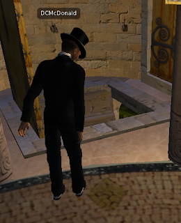
Yay more birds...
Teleported Just in time for the #Superbowl party
Doom
Game Summary: Doom is a standard first person shooter where the user is given the experience that he/she is running around with a weapon, killing villians to get through levels or “Episodes.” The goal is to uncover hidden secrets, weapons, and bonus levels, while working through an interesting story line. The Story behind the game is the user or "hero" is the last space marine left on the moons of Mars. The moons have been invaded by demons, and it is the players role to fight through the monsters level by level to eventually make his way back home. As the player progresses through the “epsiodes” a story line starts to form, revealing more information as you get through levels.
When Playing a game like Doom it is pretty obvious what the user is about to get themselves into...blood, guts, and horror. When picking out a game or browsing in the stores or online, the first thing that stands out to anyone is the title. Is it intriguing? Would it be of interest? What does the design and preview pictures tell me? For any gamer looking for a thrill, Doom is the perfect game for them. Although the game is old (released in 1993) many who start playing will find themselves engulfed in the game for hours, resulting in complete loss of time.
Preparing for Hell: The Game Begins at the Menu screen, here the player is given the option to start a new game, load an already saved game, or adjust the sounds, settings and controls. As all of this is taking place, there is a preview of the game running in the background, playing a reel of what the user is about to get themselves into. Once the user hits “new game” they are asked to choose their difficultly level. The clever part here is instead of choosing from, novice, intermediate, and hard. Users must pick from an array of perspective scenarios they might be getting themselves into, which would indicate the difficultly of play. Choices like “I’m too young to die”, “ Hey not too rough”, “hurt me plenty”, and “Ultra-Violent.” These simple changes, help instill a small sense of fear and anxiety into the user, leaving them thinking, “ok this shouldn’t be too rough” or “I need to be on my A-game instantly because this is going to be ultra violent.” Also as the gamer flows through these options, it is important to note that the visuals are all cohesive further enhancing the experience of the game. The screen is dark, the words are written in blood, and the noises and sound are far from pleasant. The user is instantly brought into a state of high awareness and anxiety. Their impending doom is on the horizon....
Lets kick ass and take names: Once the user picks their difficulty level, the current screen melts away throwing them right into the game. From here our gamer is greeted with a dashboard of stats, the level in front of them, and an image of “your arm” with the given gun. The dashboard displays stats like ammunition, life percentage, and an image of the “space marine’s” face cautiously looking about for demons. As the player moves, the face in the dashboard reacts to what happens. If a new, better gun is obtained, he’ll grin with joy, if he is hurt, he will wince with pain, as the user hears him cringe. This simple feature allows the player to create a connection with the games “hero,” if hurt in the game, then the player will react in a similar manner, trying desperately to stay alive at all costs. In Doom, the more a player explores, kills, and discovers secrets the more points he can get, making it easy for him to travel through the game later on. The user wants to discover as much as possible so they can understand the full story behind each “episode.” In a first person shooter such as Doom there are surprises around every corner. As users draw closer to their enemy, the sound of breathing demons can be heard. The closer they get the breathing deepens, with finally the monster popping out, chomping down on ones face (Om nom nom FLESH!) until the gamer can shoot it down.
Game Play: The game play in doom is very easy to pick up and figure out, to move, the user can either use a joy stick if attached or just as easily use the arrow buttons on any key board. Opening the door is a simple as clicking the space bar (conveniently located right next to the arrow keys) and changing weapons is as easy as 1, 2, 3 (literally) each number represents one of the 10 weapons the user can obtain. The controls in the game can also be adjusted and customized to work for the user. This feature is key in keeping players coming back. When a game is customizable to how the user uses controls, they feel more comfortable using the game, putting the concentration towards the story line and whats going on, not on if they will hit the right key to fire their weapon.
Great experience: Overall this game has an amazing user experience, the cohesive experience, creates excitement, anxiety, and curiosity for the gamer. Although the game is old, the platform leaves users wanting more. The short, peculiar story line is intriguing, and the drive to beat scores, and find secrets is a gold mine of knowledge, granting bragging rights to any Doom geeks.
Subscribe to:
Posts (Atom)